Home
» Tips
»
Minimalist Investor Pitch Deck PowerPoint Template for Tech Startups: A Practical 12-Slide Blueprint
Minimalist Investor Pitch Deck PowerPoint Template for Tech Startups: A Practical 12-Slide Blueprint
A minimalist investor pitch deck should make the company easier to understand, not merely make the slides look sparse. The useful version removes visual noise while preserving the evidence an investor needs to follow the logic from problem to solution, market, traction, business model, team, and funding request.
To make the structure concrete, this article uses a fictional startup called Nexora as an illustrative example. Nexora is not a real company, and any example wording, placeholders, or scenarios below are for demonstration only. They are not customer results, investor outcomes, market research findings, or verified operating metrics.
As checked on September 11, 2026, Microsoft still distinguishes a PowerPoint theme from a reusable template. A template can include a theme plus layouts and placeholders, and PowerPoint saves reusable templates as .potx files. Microsoft also states that creating a .potx template requires desktop PowerPoint; PowerPoint for the web cannot create one. See Microsoft Support: Create and save a PowerPoint template.
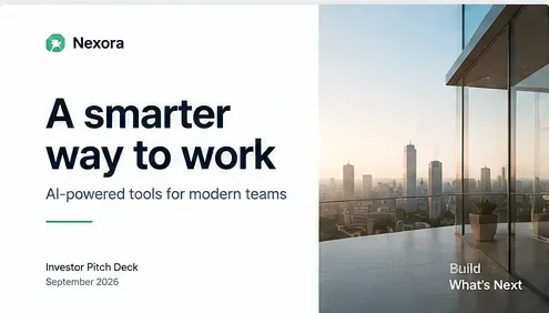
A hypothetical cover-slide example for the fictional Nexora startup; the company name and presentation details are illustrative rather than real fundraising material.
The scenario: a fictional B2B software startup preparing for investor meetings
Assume Nexora is a fictional early-stage software company building an AI-assisted workflow product for business teams. The founders want one clean PowerPoint system they can reuse for investor conversations without rebuilding every slide from scratch.
The design goal is deliberately restrained: one dark neutral, one accent color, one heading family, one body-text family, wide margins, and only a few layout types. The content goal is more demanding. Every claim that matters should either be supported by company records, supported by a checked external source, clearly labeled as a forecast or assumption, or removed.
That distinction matters because an investor deck is not exempt from accuracy simply because it is short or visually informal. The SEC states that private companies offering and selling securities are subject to federal securities laws, and every offer and sale must either be registered or conducted under an available exemption. See SEC: Private Companies and the SEC. The precise legal status of a particular deck or communication depends on the facts and the fundraising pathway, so actual fundraising materials should be reviewed with appropriate legal counsel.
A minimalist 12-slide investor pitch deck structure
Slide
Purpose
Nexora illustrative example
What should be verified before use
1. Cover
Identify the company and the core idea
“Nexora — AI-assisted workflows for modern teams”
Company name, logo rights, current date, contact information
2. Problem
Define the specific pain point
“Mid-market teams struggle to coordinate work across fragmented tools”
Customer interviews, product research, or a properly sourced external study if you make quantitative claims
3. Solution
Show what the product changes
A simple workflow diagram plus one product screenshot
Actual product capabilities; remove roadmap features presented as if already shipped
4. Why now
Explain timing
Changes in customer workflow or technology adoption that make the product timely
Current, cited evidence; separate external trends from founder opinion
5. Market
Define who buys and how large the opportunity could be
TAM, SAM, and initial target segment placeholders
Methodology, source date, segment definitions, and assumptions
6. Product
Make the product tangible
One interface view and three capability statements
Current functionality, data security claims, integrations, and availability
7. Traction
Show evidence of adoption or progress
Placeholders for revenue, users, retention, pilots, or signed contracts
Accounting records, analytics, CRM data, contract status, and the exact metric definition
8. Business model
Explain how money is made
Subscription tiers with illustrative labels rather than invented revenue
Actual pricing, gross-margin assumptions, contract terms, and sales motion
Direct competitors, internal tools, and “do nothing” as alternatives
Current competitor capabilities and fair, supportable comparisons
11. Team
Explain why this team can execute
Founder roles and relevant experience placeholders
Accurate titles, employment history, credentials, and prior results
12. Ask and use of funds
State what you are raising and what it enables
Funding amount placeholder plus allocation categories
Fundraising structure, runway assumptions, hiring plan, and legal terms
1. Make the cover slide say one useful thing
Minimalism begins by refusing to make the cover do five jobs. Nexora’s fictional cover needs only the company name, a short description of what it does, presentation date, and a contact or “Investor Pitch Deck” label if useful.
A phrase such as “A smarter way to work” can be visually clean, but it is too broad to carry the business description by itself. Pair it with a specific line such as “AI-assisted workflow software for mid-market operations teams.” The second line gives the investor a category and customer.
Apply it: if your cover could belong to ten unrelated startups after the logo is removed, rewrite the subtitle until the product and intended customer are recognizable.
2. Use the problem slide for evidence, not drama
For the fictional Nexora example, the problem slide might say that teams struggle to coordinate work across fragmented systems. That statement is presented here as a hypothetical premise, not a research finding.
If a real startup wants to claim that “62% of operations teams lose five hours a week” or that a problem costs the market billions, the deck should identify where that number came from and when the underlying research was conducted. A minimalist slide can still include a small source line.
Apply it: replace unsourced “big number” graphics with one verified statistic, one customer-derived insight, or a clear qualitative statement that does not pretend to be measured research.
3. Separate current product from roadmap
A clean solution slide often uses one interface image with three short capability statements. The risk is that founders compress “available now,” “private beta,” and “planned” into one polished slide.
For Nexora, imagine that automated task routing exists today while an enterprise governance module is only planned. The deck should not list both as equivalent current capabilities.
Apply it: use labels such as Live, Beta, and Planned where the distinction would matter to an investor. Minimalist design should reduce ambiguity, not hide it.
4. Build market slides from definitions, not giant circles
Terms such as TAM (total addressable market), SAM (serviceable available market), and SOM (serviceable obtainable market) are only useful when the deck explains how they were estimated. A minimalist market slide can show a concise calculation rather than three decorative circles with unexplained dollar values.
For Nexora, the template could reserve three lines:
Target buyer: [verified segment definition]
Annual spend basis: [source or company assumption]
Calculated opportunity: [formula and date]
Apply it: keep the calculation in speaker notes or an appendix even if the main slide shows only the conclusion. That lets you answer “How did you get this number?” without improvising.
5. Make the traction slide impossible to misread
Traction is often the most compressed slide in a startup deck, which makes metric definitions especially important. “Customers” can mean paying accounts, free users, pilots, signed contracts, or logos with no current revenue. “ARR” can be calculated differently if one-time fees, usage commitments, or unstarted contracts are included.
In the Nexora template, do not pre-fill attractive sample numbers. Use labels such as [Paying customers], [ARR as of date], [Net revenue retention definition], and [Signed pilots]. The founders then replace them with numbers reconciled to the appropriate source systems.
Apply it: add an “as of” date and define every non-obvious metric in a footnote or appendix. If a number cannot be reproduced from records, do not put it in the pitch deck.
6. Treat forecasts as forecasts
Early-stage pitch decks often include forward-looking revenue, hiring, or market-share assumptions. These are inherently uncertain. A forecast should not look visually identical to historical results.
For the fictional Nexora example, the model could show Actual for completed periods and Plan or Forecast for future periods. The template can use a different fill pattern or simple label rather than adding another color family.
Apply it: distinguish actuals from projections in the chart legend and retain the assumptions behind the forecast. Avoid presenting a target as though it has already been achieved.
7. Keep fundraising-law questions outside the design layer
A “Confidential” footer can be useful operationally, but it does not determine whether a fundraising communication complies with securities law. The SEC’s small-business resources explain that an offer and sale of securities must be registered or rely on an exemption. They also distinguish common exempt pathways.
For example, the SEC states that Rule 506(b) generally prohibits general solicitation, while Rule 506(c) permits general solicitation if all purchasers are accredited investors and the issuer takes reasonable steps to verify accredited status. See SEC: Exempt Offerings and SEC: Private Placements — Rule 506(b).
This does not mean a PowerPoint template can tell a startup which exemption to use. The right pathway depends on the offering and the facts.
Apply it: before broadly posting or circulating a fundraising deck, make sure the distribution strategy matches the company’s chosen capital-raising pathway and legal advice. Do not rely on the word “confidential” as a substitute for compliance.
8. Use Slide Master so “minimal” stays consistent
Microsoft recommends building reusable PowerPoint templates through View > Slide Master, where layouts can contain placeholders for text, pictures, charts, video, and other content. Placeholders help preserve structure when a new deck is created from the template. Microsoft also distinguishes templates from themes: a theme is primarily visual styling, while a template can include layouts and guidance about what content belongs where. See Microsoft Support: Add, edit, or remove a placeholder.
For Nexora, a practical master needs only a small layout library:
Cover
Single statement + evidence
Image or product screenshot + three points
Metrics row
Simple chart
Two-column comparison
Team
Closing / ask
Apply it: format these layouts once in Slide Master, then save the reusable file as a PowerPoint Template (.potx). Keep fictional or company-specific content out of the master itself.
Minimalist design rules that preserve substance
Design choice
Useful default
Reason
Colors
One dark neutral, one accent, one light background
Keeps hierarchy clear without turning each category into a new visual system
Typography
One heading family and one body family
Reduces visual decisions and maintains consistency
Text
One idea per slide, short supporting copy
Forces prioritization while leaving detail for notes or appendix
Charts
Direct labels and minimal decoration
Makes the metric easier to interpret and check
Images
Product evidence or relevant context
Avoids decorative stock imagery that consumes space without adding proof
Animation
Use only when sequencing information helps understanding
Prevents motion from becoming the presentation’s main feature
Before sending the deck: a founder fact-check
Every number has an owner, source, and “as of” date.
Actual results and forecasts are visually distinguishable.
Product capabilities are labeled accurately as live, beta, or planned.
Customer logos and quotes are used only with appropriate permission.
Market-size calculations can be reproduced from documented assumptions.
Competitor comparisons are current and supportable.
Team biographies contain accurate roles, employers, credentials, and dates.
The fundraising ask matches the current financing plan.
The intended distribution of the deck has been considered alongside the company’s securities-law pathway.
The reusable .potx file contains layout placeholders, not stale company metrics from the previous fundraise.
Bottom line
The Nexora example is fictional, but the workflow is practical: build a small set of reusable PowerPoint layouts, make each slide answer one investor question, and reserve visual emphasis for evidence rather than decoration. A minimalist investor pitch deck works when it compresses the story without compressing away the definitions, sources, dates, and assumptions that make the story credible.
Use the template to standardize design. Do not use it to standardize facts. The structure can remain the same from meeting to meeting; the metrics, market claims, product status, financing terms, and supporting evidence should be checked every time.